


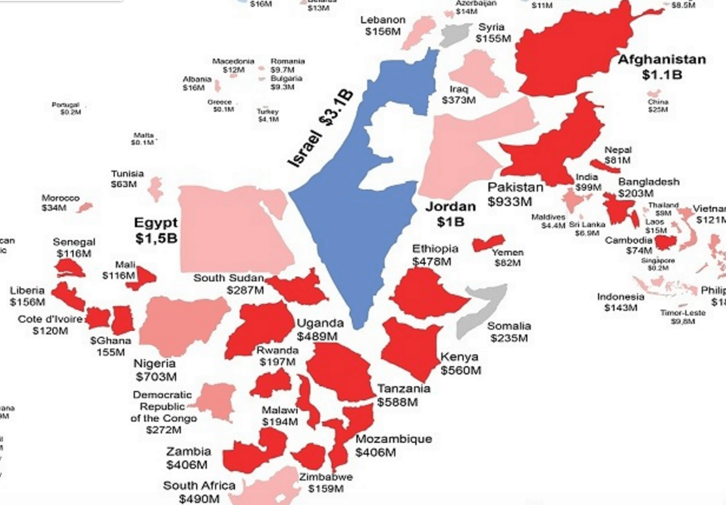
Last year, the U.S. spent $35 billion providing 142 foreign countries with financial aid. Now you can see where most of the money went in a single map. The site HowMuch.net created an infographic that resizes each country based on how much U.S. aid it received. As you can see, with $3.1 billion, Israel received more than double the aid of any other country. As Market Watch notes, most of that was military spending. Other leaders included Egypt ($1.5 billion), Afghanistan ($1.1 billion), Jordan ($1 billion) and Pakistan ($933 million). Overall, global health programs received the biggest portion of foreign aid, with 24 percent. You can go here to see a full-size image of the map.