


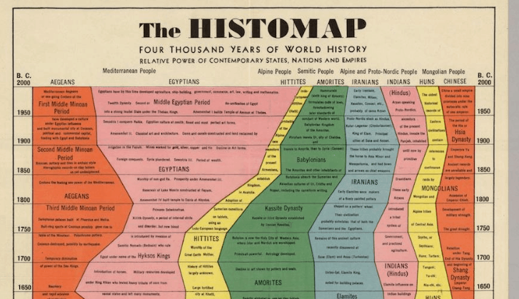
Slate’s history blog has uncovered this amazing, incredibly detailed “Histomap” that tells the entire story of human existence in one, colorful, massive info-graph. The 5-foot-long map was originally sold to schools and students for just $1 back when it was published by Rand McNally in 1931. As Slate points out, “The chart emphasizes domination, using color to show how the power of various ‘peoples’ (a quasi-racial understanding of the nature of human groups, quite popular at the time) evolved throughout history.” Despite some modern criticism of its categorization methodology, it’s still an impressive work of visual storytelling …